By Amy Servi
How can you make your school more safe and sanitary for all? One way is to make sure your social distancing signs and products are exactly where they should be to effectively reach as many people as possible.
In this article, we’ll walk you through the all-too-common issues with current social distancing signage practices and show exactly how you can make sure your educational institution doesn’t make the same mistakes.
Social Distancing Awareness Signs: What Went Wrong
When the COVID-19 pandemic first began, it seemed as though you could not go anywhere without seeing a wall, window, or door sign asking for your cooperation in maintaining social distancing protocols or floor decals instructing you which way to go and where to stand.
As time went on and signs, decals, and one-way floor signs stuck to the ground became tattered and faded from constant foot traffic, and signs ruined by the weather were replaced with black and white paper printouts reading “please respect social distancing guidelines” on the entrance and exit of doors.
Combined with the removal of sneeze guards and masks, public buildings all over the country seemed to have quickly unlearned the safety protocols we have been abiding by since the early months of 2020.
Although there is light at the end of the tunnel, we are not yet out of the woods. It’s just as important now as ever to remind students, staff, employees, patrons, and customers about why social distancing matters and how they can do their part in staying healthy and, in turn, helping others stay healthy, as well.
Here are three ways you can positively share the message of health and safety with social distancing signs and products.
- [Simply] Get the Point Across with Words & Visuals
Instructional signs made with hard-to-read fonts and colors and lacking visuals will not be very effective in reminding the intended crowd what they should be doing when they enter the building. Ensure your intended message is understood with signage that’s legible and easy to understand.
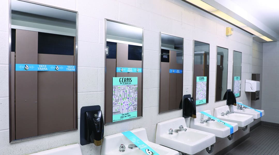
You could place social distancing facility signs on the windows and doors of your building, clean hand bathroom signs on walls or mirrors next to the sink, or eye-catching social distancing signs on the windows, walls, and doors students and staff most often use.
- Make Sure Your Products Can Be Seen
Aside from your sign’s messages being both direct and legible, they should always be visible, as well. This might seem obvious, but paying special attention to where your signs are placed can make all the difference in who sees them (and who doesn’t!).
For instance, you may think that the sign looks great on the back of the door, but is the sign still visible when the door is propped open?
Be sure your signs are big enough and placed in a spot and height that anyone entering the room by walking or wheelchair can see.
If implementing hand sanitizer stations throughout your building, we recommend placing them in entrances of and exits of bathrooms, cafeterias, meeting rooms, transaction counters, and the main doors to the building.
- Overcluttered = Ineffective
Clutter is overwhelming, and it’s definitely not the most effective way to get your point across. To make your message seen and understood, be sure you’re not overwhelming the intended audience with dozens of messages they likely will not take the time to stop and read, let alone be able to read and understand when quickly walking by. Simplicity is key!
By following these social distancing signage tips, you can make the task of informing all who enter your public space easy and effective.
Amy Servi is with iMBranded, a national leader in manufacturing and designing architectural millwork and large format graphics. They created Safely6ft social distance solutions in response to the pandemic, www.safely6ft.com.


