By Diana Rendina
When I first arrived at my school, the library was in pretty dismal shape. It was dark, dingy, cluttered and pretty much the opposite of student-friendly. Over the course of five years, I gradually changed things up and redesigned our learning space into one that is flexible, collaborative, and fun. Here are six things we did to change up the space that you can apply in your own space as you rethink your library.
1. Removing Obstacles and Clutter
When I arrived, the collection hadn’t been weeded in decades. My supervisor had come in and gutted the worst of it before I got there, but even then, I was finding books on the shelves that hadn’t been checked out since 1971! Not only were the shelves cluttered, but they also took up all the space. About 50% of the floor space was taken up with massive floor shelving. Every inch of available wall space had shelving, too. There was no room to breathe. The small instruction area had ten 60 x 36 heavy wooden tables and about fifty heavy wooden chairs that couldn’t stack. There were odd extra desks and tables taking up a ton of space. Students were constantly bumping into furniture and each other.
I began massively weeding the collection, paring it down to the books that students were actually reading. I broke up the monotony of the shelves by creating displays within them. I rearranged the books and removed wall shelving to open up some space. I had excess furniture that we weren’t using removed. I got permission to remove the often broken alarm system to open up more room and make the library feel more welcoming. All of this didn’t cost our school any money, but it made a huge difference in the functionality of the space. Sometimes, less is more.
2. Adding Color
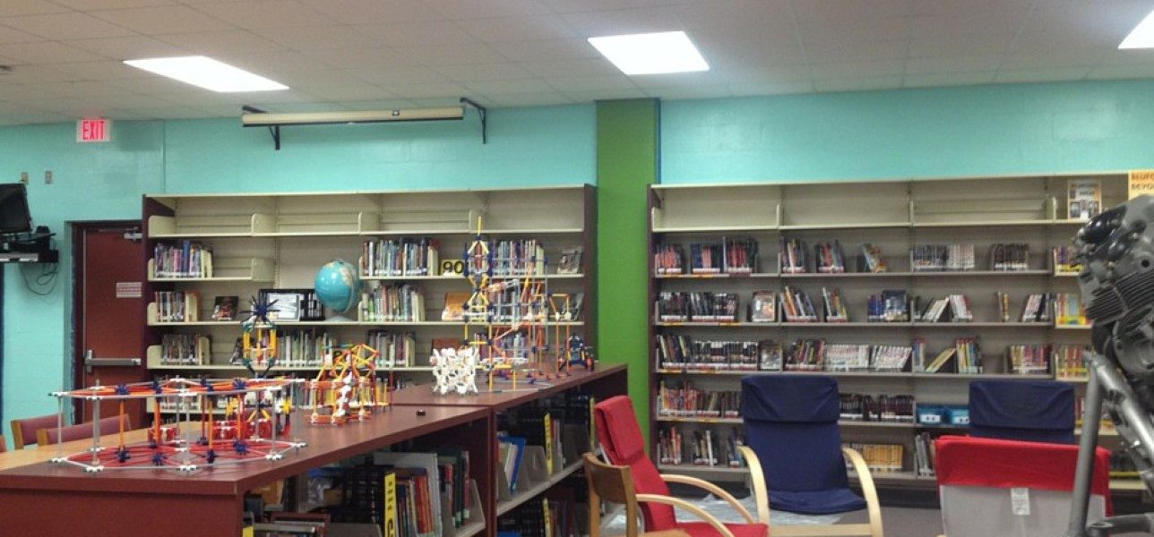
When we received a $5,000 grant from Lowe’s Toolbox for Education last year, it included money to get paint and painting supplies to add color to our library. We have no windows, which is a problem that I haven’t been able to fix yet. With the dull beige walls, it felt kind of like a cave in there. So we brightened things up by adding blue and green to our walls. It’s made a huge difference in our space – it’s helped our library to become a more vibrant and active space. Even if we hadn’t been able to get the grant, the cost of paint and supplies was only a couple of hundred dollars, which many schools could get donated from local businesses or PTSA.
3. Movement and Flexibility
The heavy wooden tables and chairs our library had were not flexible enough for our space. The table legs were frequently breaking from the tables being dragged across the floor and rearranged. Whenever we needed more floor space (for book fairs, special events, etc.) we had to stack the wooden chairs one on top of the other in an awkward way in front of the bookshelves, preventing students from checking out books and potentially causing safety hazards.
The majority of our Lowe’s Toolbox grant was spent on purchasing six 60 x 30 Bretford Flip & Nest tables and four quarter round whiteboard top tables. We also purchased forty blue stacking chairs. This dramatically increased the flexibility of our space by allowing us to quickly rearrange tables and chairs to suit our needs. The chairs are lightweight and comfortable and can stack six high and are easy to store in the backroom if we need more space.
We also funded a DonorsChoose project to add six Hokki stools to our library. These have been fantastic for our kinetic students who find sitting still to be torture. You’ll often see students pulling one up to a table to work on a project with fellow students.
4. Variety of Seating
One thing I learned from the book Make Space is the importance of having a variety of seating options. High. Low. Hard. Soft. So I’ve been proactive about ensuring that there are plenty of options for my students. There are comfortable soft chairs in our brainstorming lounge, perfect for dreaming up their next project. We have high cafe tables and stools, perfect for sharing a game of chess or chatting while waiting on other students to finish checking out. We have “rocking” chairs and Hokki stools to allow for movement. And we have standard chairs to make sure we have enough seating for everyone.
5. Interactive Spaces
Libraries should not be static places. If you look at the offices of innovative companies (Google, Facebook, etc), you will find plenty of interactive spaces for employees to relax, collaborate and have fun. Drawing from this inspiration, I’ve been intentional about adding more interactive elements to our library. The most obvious is our Makerspace, where students are invited to sit and tinker with LEGOs and K’nex. Within this space is the centerpiece of our library, our Epic LEGO wall, where students can build amazing vertical LEGO creations. We also have our whiteboard wall, where students can doodle, collaborate and brainstorm. We have lots of whiteboard tables throughout our library too, which students often take advantage of to jots notes for their homework, work out an algebra problem or keep score during chess. We also have an interactive short throw projector in our instructional space.
6. More Power!
We are a BYOD library, and one thing that I noticed was how students (and teachers) were always struggling to find outlets. They’re all hidden underneath our bookshelves, which make them difficult and awkward to access. As we’ve removed some wall shelving to make more room, we’ve opened up access to more outlets. We’ve also added several charging stations where students and teachers are invited to charge up their devices. These areas have become the new water cooler, as students gather around to charge their devices.
Diana Rendina is a librarian and the founder of Renovated Learning, which focuses on rethinking, remaking, and renovating learning and how we create learning experiences as educators, www.renovatedlearning.com.


